
Your contact page is probably the most neglected page on your entire store. Most merchants copy a template, drop in a form, and move on. But here's the thing: 49% of ecommerce contact forms get abandoned before the customer finishes filling them out (FinancesOnline). That's almost half your potential support interactions, gone.
A good ecommerce contact page isn't just about letting people reach you. It's a trust signal, a conversion tool, and often the page that decides whether a hesitant shopper becomes a buyer or bounces. This guide covers 12 specific ecommerce contact page best practices, each tied to data and real outcomes. No fluff, no "get inspired by these 40 examples." Just what works.
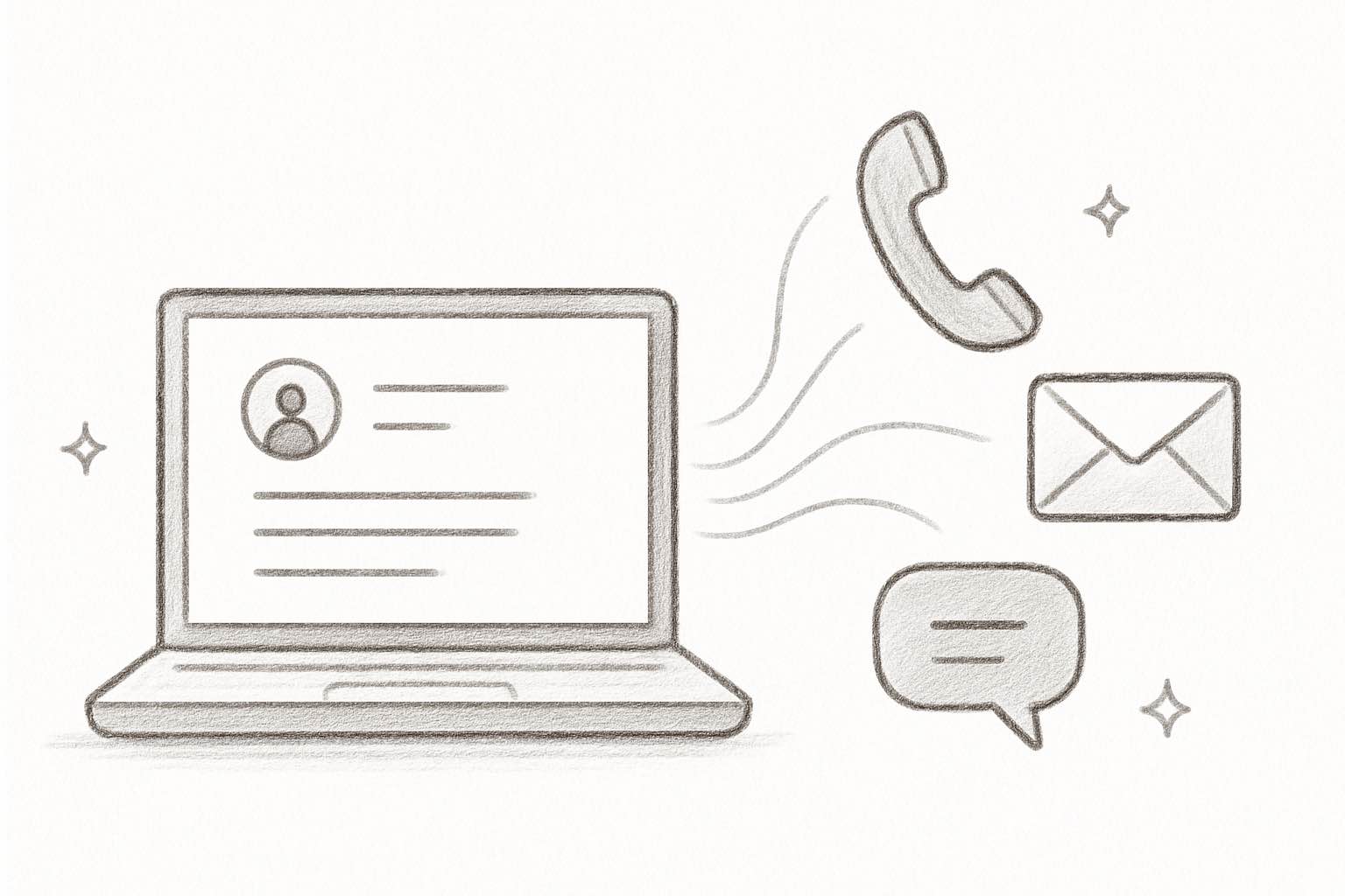
Hear what AI support calls sound like for your store. Just paste your Shopify URL and get sample calls in under 20 seconds, no email required. Listen to demo calls for my store.
Why your contact page is a revenue page
Most store owners treat the contact page like a formality. It's not. According to Salesforce, 95% of consumers say customer service is essential for brand loyalty. And 75% of shoppers judge whether your brand is trustworthy based on how your website looks and functions (Stanford Web Credibility Research).
Your contact page is where trust gets tested. A shopper who can't find your contact info, or who lands on a broken form with 12 fields, is a shopper who's already halfway to a competitor. On the other hand, a clean contact page with multiple ways to reach you tells the customer: "We're real. We're reachable. We care."
Here's what a strong contact page actually impacts:
- Conversion rate: shoppers who see accessible support options are more confident buying, especially on first orders
- Customer retention: 83% of consumers trust a company more when they provide excellent CX (Salesmate)
- Repeat purchase rate: customers who get fast, helpful responses come back more often
- Customer lifetime value: a single positive support interaction can increase average order frequency by 20-30%
That signal directly affects your bottom line. Think of your contact page less like a formality and more like a landing page for trust.
12 ecommerce contact page best practices
1. Put your contact page where people expect it
This sounds obvious, but you'd be surprised how many stores bury their contact link. Your "Contact" or "Help" link should be visible in two places: the main navigation bar and the footer.
Don't hide it inside a hamburger menu. Don't make shoppers scroll to the bottom of your homepage to find it. According to Forrester, 89% of consumers will spend more with companies that let them find answers easily. Making your contact page hard to find sends the opposite message.
If you also have a help center or FAQ, link to both in the nav. Separate "Help" and "Contact" if they go to different pages.
2. Offer multiple contact channels
Not every customer wants to fill out a form. Some want to call. Some prefer chat. Some will email.
Your contact page should list every way a customer can reach you. At minimum, include:
- Contact form: for non-urgent questions
- Email address: for customers who prefer their own inbox
- Phone number: for urgent issues or shoppers who want a real person
- Live chat: 73% of consumers find chat the most satisfying contact method
- Social media links: for customers who already follow you
Giving people options isn't just good UX. It's good business. Shoppers who can reach you on their preferred channel are more likely to buy, and more likely to come back. For more on structuring your ecommerce phone support, we've written a full guide.
3. Keep your contact form short
Here's where a lot of stores get it wrong. They add fields for phone number, order number, subject line, department dropdown, and a CAPTCHA. Then they wonder why nobody fills it out.
The data is clear: 27% of users abandon forms because they're too long (FinancesOnline). And 37% will bail if you require a phone number (Feathery).
Stick to three fields: name, email, message. That's it. If you need more context (like an order number), make extra fields optional. The best-converting contact forms have 3-4 fields total.
Need help with conversion rate optimization? Start with your forms.
4. Set clear response time expectations
"We'll get back to you" isn't good enough. Tell people exactly when.
The industry average first response time for ecommerce is 4-6 hours, and the best-in-class teams respond in 30-60 minutes (eDesk). Whatever your actual response time is, state it clearly on the contact page.
Something like: "We typically respond within 2 business hours" sets the right expectation. Then back it up with an automated confirmation email after they submit the form. Bonus points if that email includes a link to your FAQ or help center for common questions.
This single change reduces "did you get my message?" follow-ups and builds immediate trust. We cover more on this in our guide to customer service response time benchmarks.
5. Add an FAQ section to your contact page
Not everyone who lands on your contact page actually needs to talk to a human. Many are looking for quick answers: "Where's my order?" "What's your return policy?" "Do you ship internationally?"
According to Forrester, 89% of customers will spend more with companies that allow them to find answers online without contacting anyone. That's a massive incentive to put self-service front and center.
Adding a short FAQ section (5-8 of your most common questions) directly on the contact page serves two purposes. It gives self-service shoppers an instant answer. And it reduces your ticket volume by deflecting routine questions.
The best topics to cover in your contact page FAQ:
- Order tracking: "How do I track my order?" (this is the #1 support question for most stores)
- Returns and exchanges: link directly to your return policy or portal
- Shipping times and costs: especially international shipping
- Sizing and product questions: if you sell apparel or products with variants
- Payment methods: what you accept and when charges process
If you have a full help center or knowledge base, link to it prominently. But put the top-hit answers right on the contact page itself. The goal is to resolve the question in one page view, not send people on a scavenger hunt.
6. Include a phone number (yes, really)
A lot of ecommerce store owners skip phone support entirely. "Nobody calls anymore," they say. But the data tells a different story.
76% of consumers still prefer phone calls for support, and phone support satisfaction sits at 91%, higher than any other channel (Nextiva). Even if most of your customers use chat or email, having a phone number visible on your contact page is one of the strongest trust signals you can add.
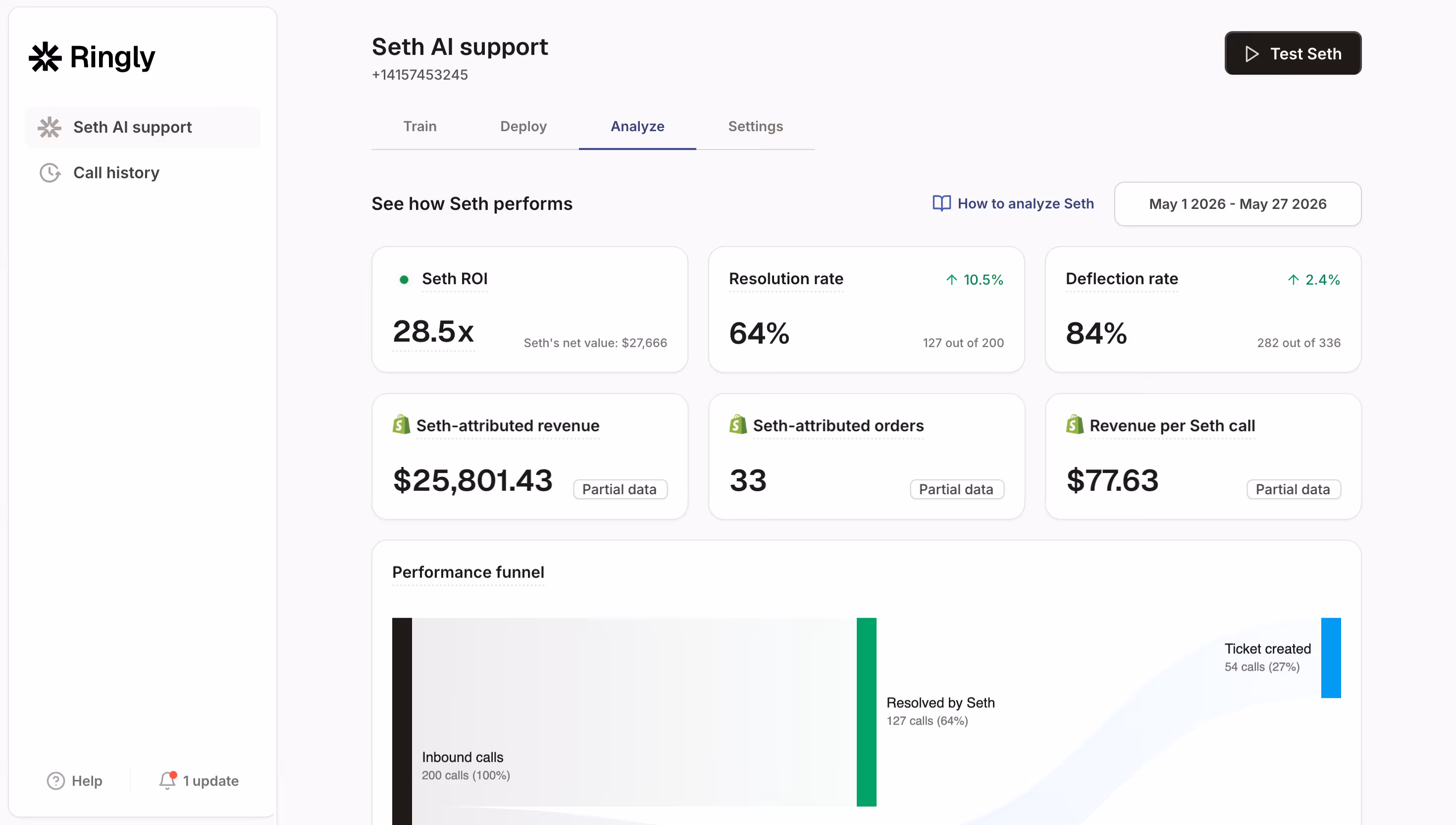
The real objection isn't "does phone work?" It's "I can't staff phones 24/7." And that's where AI phone agents come in. Tools like Ringly.io put an AI agent on your phone line that handles order lookups, return requests, and product questions around the clock. It resolves about 73% of calls without a human, speaks 40 languages, and sets up in three minutes.
If you've been avoiding phone support because of cost, AI changes the math completely.
Try Ringly.io free for 14 days and see how AI phone support works for your store.
7. Route inquiries by type
When every customer question lands in the same inbox, things get slow. A wholesale inquiry sits next to a "where's my order?" ticket, and your team has to sort through everything manually.
Add a simple dropdown or category selector to your contact form. Common categories include:
- Order issues: tracking, shipping, delivery problems
- Returns and exchanges: refunds, wrong items, damaged products
- Product questions: sizing, compatibility, availability
- Wholesale and partnerships: B2B inquiries that need a different team
- Press and media: keep these out of your support queue
This routes questions to the right person (or the right automation) and cuts response time significantly. The first-contact resolution rate goes up too, because the person answering already has context.
If you're figuring out how to structure your customer service team, this is one of the first things to set up. It's low effort and high impact.
8. Make it mobile-friendly
78% of ecommerce traffic comes from mobile devices (OuterBox). If your contact page doesn't work well on a phone, you're losing the majority of your potential interactions.
Here's what mobile-friendly actually means:
- Tap-friendly buttons: at least 44px tall, with spacing between them
- Readable form fields: no tiny inputs that require pinch-zooming
- Click-to-call phone number: one tap should start the call
- No horizontal scrolling: everything fits the screen width
- Fast load time: compress images, skip heavy scripts
Don't just resize your browser to test. Pull up your contact page on an actual phone. Fill out the form with your thumbs. If it's frustrating, fix it. Check our mobile commerce statistics for more on why this matters.
9. Match your brand voice and design
Your contact page shouldn't look like it belongs to a different website. If your store has a playful, casual brand voice, your contact page should too. If your brand is clean and minimal, the contact page should match.
This applies to both visual design and copy:
- Colors and fonts: use the same brand palette and typography as the rest of your store
- Imagery: include brand-consistent photos or illustrations, not generic stock images
- Copy tone: "Drop us a line" hits differently than "Submit an inquiry." Pick the one that sounds like you.
- Page layout: match the overall layout style of your other pages (header, spacing, footer)
Some brands do this brilliantly. Pit Viper's contact page is as bold and irreverent as their sunglasses. Ban.do's is warm and inviting, matching their playful product line. YETI's is clean and rugged, just like their branding.
The point isn't to be funny or serious. It's to be consistent. Your customer experience extends to every page, including this one. A contact page that feels like a different website erodes the trust you've built everywhere else.
10. Add trust signals next to your form
A form sitting alone on a blank page doesn't inspire confidence. Surround it with signals that say "this is a real business."
Good trust signals for your contact page include:
- Physical address: even if you're online-only, a mailing address adds legitimacy
- Business hours: tells customers when to expect a response
- Team photos: puts a face to the brand (83% trust companies more with excellent CX, according to Salesmate)
- Security badges: if you're collecting any sensitive info, show you protect it
- Average response time: "We typically reply within 2 hours"
29% of people abandon forms because of security concerns. Trust signals directly counter that hesitation. For more ideas, see our guide on how to improve customer satisfaction on Shopify.
11. Connect self-service tools
Your contact page should help customers help themselves before they even submit a form. That means linking to:
- Help center or knowledge base: for detailed answers to common questions
- Order tracking page: so they can check their order status without waiting for a reply
- Return/exchange portal: for a self-guided process that doesn't require an email
- Shipping information page: for delivery estimates, carrier details, and international policies
- Size guides: if you sell apparel, link directly to sizing charts
If you can embed a live order lookup directly on the contact page (enter your order number, see your status), even better. This handles WISMO calls (where is my order?) before they become tickets. "Where is my order?" makes up 30-50% of all ecommerce support tickets for most stores, so automating that alone is a huge win.
The goal isn't to hide your contact form. It's to solve problems faster. Self-service done right actually increases customer satisfaction, because people get answers instantly instead of waiting hours. And it frees your team to spend time on the complex issues that actually need a human.
Ready to see what AI phone support looks like for your store? Start your free trial. Setup takes three minutes.
12. Track and optimize your contact page
Your contact page shouldn't be a "set it and forget it" page. Treat it like a landing page and measure its performance:
- Track form submissions: how many people start vs. finish the form?
- Monitor abandonment: where do people drop off? Which field causes the most exits?
- Measure response time: are you hitting the expectations you set? The best teams target under 60 minutes.
- Review channel usage: which contact method do customers actually use? You might find 80% use chat and 5% use the form.
- A/B test: try different form lengths, CTA copy, and channel placements
- Track resolution outcomes: what percentage of contacts are resolved on first reply?
Set up Google Analytics events for form starts, completions, and abandonments. Most form builders (Typeform, Jotform, even Shopify's built-in forms) can report on completion rates natively.
Use your ecommerce analytics tools to set up basic funnel tracking on the contact page. And review your customer service KPIs monthly to spot trends. If you notice form abandonment spiking, it's usually a sign you've added too many fields or broken something on mobile.
The best contact pages aren't designed once. They're improved continuously based on what customers actually do.
Common contact page mistakes to avoid
Even with the best intentions, some mistakes keep showing up. Here are the ones that hurt the most:
- Hiding the contact page: if customers need more than two clicks to find it, you've already lost some of them. Put it in the main nav and the footer.
- Requiring account creation: forcing someone to create an account before they can ask a question is a guaranteed drop-off. Let anyone submit a form.
- No confirmation after submission: if nothing happens after they hit "Send," they'll assume it didn't work and contact you again (or just leave). Always show a confirmation message and send an auto-reply email.
- Using a generic "info@" email with no response: listing an email you don't actually check is worse than not listing one at all. If you list it, monitor it.
- Only one contact channel: not everyone wants to fill out a form. Offer at least two options. Some shoppers want to call, some want chat, some want email.
- Making phone number a required field: remember, 37% of users abandon forms that require a phone number. Make it optional or remove it entirely.
- Ignoring mobile: if your form is broken on phones, 78% of your traffic can't use it. Test on real devices, not just a resized browser window.
- No FAQ or self-service links: sending every visitor into a form queue when 60% of them could self-serve creates unnecessary wait times for everyone.
Most of these are quick fixes. And each one you address directly improves your contact page conversion rate and your customer's experience. For more on avoiding common pitfalls, check out our guides on handling customer complaints and customer service scripts.
Frequently asked questions
What should an ecommerce contact page include?
At minimum: a short contact form (name, email, message), your email address, a phone number, links to your FAQ or help center, and your business hours. If you offer live chat, include that too. The more channels you provide, the more accessible your store feels.
How many form fields should a contact page have?
Three to four is the sweet spot. Name, email, and message are essential. You can add an optional dropdown for question type. Each additional required field increases your form abandonment rate, so keep it minimal.
Should I add a phone number to my contact page?
Yes. Even if most customers don't call, a visible phone number is one of the strongest trust signals you can display. 76% of consumers prefer phone support, and phone satisfaction scores (91%) are higher than any other channel. If staffing is a concern, AI phone agents can handle calls 24/7.
How do I handle contact requests as a small team?
Focus on three things: set clear response time expectations so customers aren't left wondering, add an FAQ section to deflect routine questions, and consider AI tools for chat and phone support. A single person can manage a high-quality contact page by combining self-service with automation.
Does my contact page affect SEO?
Indirectly, yes. Google considers E-E-A-T (experience, expertise, authority, trustworthiness) when ranking pages. A well-structured contact page with a physical address, phone number, and clear business info signals legitimacy. It also reduces bounce rate, which can improve your overall site performance.
How often should I update my contact page?
Review it quarterly at minimum. Update business hours for holidays, refresh your FAQ based on recent support tickets, and check that all contact methods still work. If you change your support tools or add new channels, update the page immediately.
Can AI handle contact page inquiries?
Yes, and increasingly well. About 30% of customer service cases are already resolved by AI, and that number is expected to hit 50% by 2027. AI phone agents, chatbots, and automated email triage can handle routine questions (order status, returns, product info) while routing complex issues to humans.
Your contact page is a competitive advantage
Most of your competitors treat the contact page as an afterthought. That's your opportunity.
Start with the basics: short form, multiple channels, visible placement, and clear response times. Then layer in self-service tools, AI phone support, and trust signals. Each improvement makes your store feel more professional, more trustworthy, and easier to buy from.
The stores that get this right don't just reduce support costs. They build the kind of loyalty that turns first-time buyers into repeat customers. And in ecommerce, repeat customers are where the real margin lives.
Try Ringly.io free for 14 days and get AI phone support answering calls for your store in three minutes.