

Your churn number ticked up two points last month. The dashboard told you that in about four seconds. What it didn't tell you is why, or which 40 subscribers you can still save this week.
That's the whole tension with subscription analytics software. The good tools make MRR, churn, LTV, and cohort retention legible in a way a Shopify report never will. They just stop at the number. Picking the right one means knowing which kind of tool reads your data cleanly, and being honest about where the dashboard ends and the actual save work begins.
I run Ringly, which is AI phone support for Shopify brands, so I spend a lot of time inside the call logs that sit one layer underneath everyone's retention chart. To write this I connected a real Shopify subscription store to the main tools and watched whether MRR, churn, and cohort retention came through clean from Shopify subscription data, not just Stripe. Below is the honest version: eight tools, three camps, and what each one is actually good at.
This post in 30 seconds.
- The 8 best subscription analytics tools split into three camps: SaaS-grade revenue analytics (ChartMogul, Baremetrics, ProfitWell, Maxio), Shopify-native subscription analytics (Recharge, Loop, Stay AI), and behavioral (Mixpanel). Pick by where your subscription data lives.
- The average ecommerce subscription brand churns 6.5-8.5% monthly, and 25-40% of that is failed payments, not people who decided to leave.
- Built for founders, COOs, and Heads of CX at $10M-$100M Shopify DTC brands who want one clean retention number and a plan to move it.
Most $10M-$100M Shopify subscription brands I talk to already have a churn number their board asks about every month. The problem isn't measuring it. It's that the cohort chart is a lagging readout of an experience that happened weeks ago, often on a phone line nobody picked up after 6 p.m. If that sounds like your store, book a 30-min call and we'll look at what's hiding under your retention chart.
What subscription analytics software actually measures
Before the tool list, the metrics. A subscription analytics tool exists to turn raw billing events into the handful of numbers that decide whether your recurring revenue is growing or quietly bleeding.
The core set is small:
- MRR and ARR: monthly and annual recurring revenue. The top-line health number, broken into new, expansion, contraction, and churned MRR so you can see what's actually moving it.
- Churn rate: the percentage of subscribers (or revenue) you lose in a period. Tracked as customer churn and revenue churn, because losing one whale isn't the same as losing ten small accounts.
- LTV: lifetime value, what an average subscriber is worth before they leave. The number you compare against acquisition cost to know if growth is profitable, and it moves with your average order value.
- Cohort retention: how each month's signups behave over time. This is the chart that exposes whether your product keeps people or just rents them for two months.
- Net revenue retention: expansion minus contraction and churn. Above 100% means your existing base grows even if you sign nobody new.
The single most useful view a subscription analytics tool gives you isn't a number, it's the cohort retention grid, because it turns "churn is 7%" into "subscribers who joined in March are gone by June and here's where the cliff is." Once you can see the cliff, you can go fix the thing that causes it.
For context on what "good" looks like: the average monthly ecommerce subscription churn in 2026 runs 6.5-8.5%, with under 5% considered top-quartile, according to Eightx's 2026 benchmark data. Replenishment categories like supplements, coffee, and pet consumables sit under 4%. If you want the wider picture, we keep a running set of customer churn statistics updated for the year.
The 3 camps of subscription analytics tools
Here's the thing most roundups skip, and it's the only thing that actually helps you choose: subscription analytics software comes in three camps, and they read different data.
Camp 1: SaaS-grade revenue analytics. ChartMogul, Baremetrics, ProfitWell, Maxio. Built on top of a billing system (usually Stripe, sometimes Chargebee or Recurly). Strongest at investor-grade MRR/ARR reporting and revenue recognition. The trade-off: they were designed for software companies, so if your subscriptions run through a Shopify app, the data has to get there cleanly first.
Camp 2: Shopify-native subscription analytics. Recharge, Loop, Stay AI. The analytics live inside the app that already runs your subscriptions, so they read your actual subscriber, product, and failed-payment data with no plumbing. The trade-off: the reporting is tied to using that app as your subscription engine, and it's less "show this to a VC" than ChartMogul.
Camp 3: Behavioral analytics. Mixpanel (and Amplitude in the same lane). These answer why, not how much. They track what subscribers do, where they drop, which behaviors predict a cancel. They don't natively report MRR, so they pair with a revenue tool rather than replace it.
Pick the camp before you pick the tool: the right answer is "where does my subscription data already live," not "which dashboard is prettiest." A brand running Recharge usually shouldn't buy ChartMogul to learn its churn rate. A brand prepping a raise usually shouldn't rely on a Shopify app's reporting alone.
The 8 best subscription analytics software tools (2026)
I scored each tool on five things: how cleanly it reads subscription data, the depth of MRR/churn/LTV/cohort views, pricing at real revenue bands, how much setup it needs, and whether it tells you anything you can act on the same day. Here's the at-a-glance table, then the deep dives.
| Tool | Camp | Reads data from | Pricing (entry) | Best for |
|---|---|---|---|---|
| ChartMogul | SaaS-grade | Stripe, Chargebee, Recurly, API | Free under $10K MRR, then $100/mo | Investor-grade reporting |
| Baremetrics | SaaS-grade | Stripe-native | ~$108/mo at $10K MRR | Fast, clean Stripe dashboard |
| ProfitWell | SaaS-grade | Stripe, billing API | Free (metrics) | Free core metrics + benchmarks |
| Maxio | SaaS-grade | Billing + ERP | Custom quote | Finance-grade reporting at scale |
| Recharge | Shopify-native | Shopify subscriptions | ~$99/mo + revenue % | Brands already on Recharge |
| Loop | Shopify-native | Shopify subscriptions | Free tier, then % + per-txn | Retention-first DTC analytics |
| Stay AI | Shopify-native | Shopify subscriptions | $499/mo + 1% + $0.19/txn | AI churn forecasting at scale |
| Mixpanel | Behavioral | Event data | Free to ~1,000 users, then ~$25/mo | The "why" behind retention |
1. ChartMogul
Best for: SaaS and subscription businesses that want investor-grade reporting. ChartMogul is the mid-market subscription analytics platform with the deepest data model, pulling from Stripe, Chargebee, Recurly, Zuora, and via API or CSV.
It's the tool most founders reach for when a raise is on the horizon, because the segmentation and the MRR movement breakdown hold up to investor scrutiny. The data model is clean and the free tier is genuinely useful.
Pricing
| Plan | Price |
|---|---|
| Under $10K MRR | Free |
| $10K-$75K MRR | $100/mo |
| $75K-$300K MRR | $300/mo |
| $300K+ MRR | $599/mo |
What works
- Deepest segmentation: slice MRR and churn by plan, geography, cohort, or custom attribute.
- Free under $10K MRR: full core analytics, no card required, which is rare in this category.
- Multi-source billing: not locked to Stripe, so it survives a billing migration.
What doesn't
- Built for SaaS billing data: if your subscriptions run through a Shopify app, you need the data to flow in cleanly first.
- Setup rewards clean data: messy or duplicated billing records show up as messy analytics.
Why it ranks first
For a brand that needs reporting a board or investor will trust, ChartMogul is the strongest pick in the category. The free tier also makes it the easiest to try.
2. Baremetrics
Best for: Stripe-powered subscriptions that want a fast, pretty dashboard. Baremetrics is the visually clean Stripe-native option, live in minutes once you connect Stripe.
It pioneered the public Open Benchmarks idea, and the dashboard is genuinely nice to look at. The catch is price and Stripe-skew.
Pricing
| MRR band | Price |
|---|---|
| ~$10K MRR | ~$108/mo |
| ~$50K MRR | ~$258/mo |
| ~$100K MRR | ~$358/mo |
| ~$500K MRR | $500+/mo |
Add-ons (Recover dunning, Cancellation Insights, Forecast+) stack on top.
What works
- Instant Stripe setup: connect and the dashboard populates, no data engineering.
- Clean, shareable views: the UI is the best-looking in the category.
- Recovery add-on: optional dunning to claw back failed payments.
What doesn't
- Pricier at the same MRR: it costs more than ChartMogul at most bands, and add-ons widen the gap, per QuantLedger's 2026 comparison.
- Stripe-skewed: best if Stripe is your billing source of truth.
Why it ranks second
If your billing lives in Stripe and you value speed and design over deep segmentation, Baremetrics is the fastest way to a real subscription dashboard.
3. ProfitWell (Paddle Retain Metrics)
Best for: brands that want core metrics free and might add churn recovery later. ProfitWell, now part of Paddle, gives away accurate subscription metrics with no MRR cap.
The metrics are genuinely free. The business model is the upsell into Retain, Paddle's paid churn-recovery and pricing product. Worth knowing going in, not a dealbreaker.
Pricing
- Metrics: free, no MRR cap.
- Retain (churn recovery): priced as a percentage of recovered revenue.
What works
- Free, accurate metrics: MRR, churn, LTV, retention at no cost.
- Benchmarks: compares you against 30,000+ subscription companies.
- No volume cap: the free tier doesn't expire as you grow.
What doesn't
- Free metrics are the funnel: the product exists to sell you Retain later.
- Data lives in Paddle's ecosystem: fine for most, worth noting if you're cautious about lock-in.
Why it ranks third
If budget is tight and you mostly need the numbers, ProfitWell is the obvious starting point. Just know the free metrics are a doorway to the paid product.
4. Maxio
Best for: later-stage subscription businesses that need finance-grade reporting plus billing in one place. Maxio (the merger of Chargify and SaaSOptics) combines billing, revenue recognition, and advanced analytics.
This is the heaviest tool on the list. For a finance team managing complex contracts and GAAP revenue recognition, that weight is the point. For a DTC brand that just wants churn and cohort views, it's overkill.
Pricing
Custom, quote-based, oriented toward finance teams. Expect a higher entry point than the others here.
What works
- Billing plus analytics unified: one platform for invoicing, rev-rec, and reporting.
- Finance-grade reporting: built for the controller, not just the growth team.
- Forecasting depth: strong MRR and revenue projection.
What doesn't
- Heavy and pricey: more platform than most DTC brands need.
- Slower to stand up: this is an implementation, not a connect-and-go.
Why it ranks fourth
Right tool for a scaled, finance-heavy subscription business. Wrong tool if you just want to see your churn cliff this afternoon.
5. Recharge
Best for: Shopify DTC brands already running Recharge subscriptions. Recharge is the largest Shopify subscription platform, and its analytics tie retention, churn, and revenue directly to subscriber behavior, benchmarked across 20,000+ merchants.
Because the analytics read your actual Shopify subscription data, there's no plumbing. If Recharge already runs your subscriptions, the reporting is sitting there for free.
Pricing
Subscription-app pricing: a Standard plan around $99/mo plus a percentage of subscription revenue, with Pro pricing custom. Analytics are bundled.
What works
- Native Shopify subscription data: no billing migration, no CSV exports.
- Merchant benchmarks: compare against 20,000+ subscription stores.
- Failed-payment recovery built in: dunning lives in the same place as the analytics.
What doesn't
- Tied to Recharge as the engine: the analytics come with running subscriptions on Recharge.
- Less investor-grade: fine for ops, less polished than ChartMogul for a raise.
Why it ranks fifth
If you're already on Recharge, you likely don't need a separate SaaS analytics tool to know your churn rate. Use what's bundled before you buy more.
6. Loop Subscriptions
Best for: DTC brands that want retention and analytics in one app. Loop is a retention-first Shopify subscription platform trusted by 2,400+ brands, having processed $4B+ in subscription revenue and run 400+ migrations off Recharge as of May 2026.
Loop's analytics are clean and DTC-native: MRR, cohort retention, churn patterns, product performance, and recovery analytics that show which failed-payment retries actually succeeded.
Pricing
Subscription-app pricing with a free starter tier, then percentage-plus-per-transaction pricing as you scale.
What works
- Retention-first analytics: cohort and churn views built for DTC, not borrowed from SaaS.
- Recovery analytics: see which retries won, which subscribers updated payment, which churned.
- Migration support: the 400+ Recharge migrations suggest the switch is well-trodden.
What doesn't
- Tied to Loop as the engine: like Recharge, the analytics come with using the platform.
- Younger than Recharge: smaller merchant base, though growing fast.
Why it ranks sixth
A strong pick if you want your subscription engine and your retention analytics to be the same tool, with a clear bias toward reducing churn.
7. Stay AI
Best for: scaled DTC brands that want AI churn forecasting and cancel-flow optimization. Stay AI holds a 5.0-star rating across 140+ Shopify reviews as of May 2026.
The standout is RetentionEngine, a no-code cancel-flow builder that offers personalized saves (pause instead of cancel when someone says "too expensive"). Brands using it have recovered up to 40% of would-be cancellations.
Pricing
$499/mo plus 1% plus $0.19 per transaction, with a 30-day free trial.
What works
- AI churn forecasting: predicts revenue and flags at-risk subscribers.
- RetentionEngine cancel flows: up to 40% of cancellations recovered with dynamic offers.
- Cancel-reason analytics: tells you why people leave, not just that they did.
What doesn't
- Higher monthly base: $499/mo plus transaction fees is the priciest entry here.
- Tied to Stay AI as the engine: analytics come with running subscriptions on the platform.
Why it ranks seventh
Best for a scaled brand that wants the analytics and the save-the-cancel mechanics in one AI-driven system, and can justify the base cost.
8. Mixpanel
Best for: teams that want the why behind retention. Mixpanel is behavioral product analytics with strong cohort and retention analysis, free up to about 1,000 tracked users and roughly $25/mo after.
It won't report your MRR out of the box. What it does is show you which behaviors predict a cancel, where subscribers drop in their journey, and how each cohort engages over time. It pairs with a revenue tool rather than replacing one.
Pricing
| Plan | Price |
|---|---|
| Free | Up to ~1,000 users |
| Growth | From ~$25/mo |
| Enterprise | Custom |
What works
- Deep behavioral cohorts: retention curves tied to actual subscriber actions.
- Free tier: real analysis before you pay.
- Predictive signal: spot the behaviors that precede churn.
What doesn't
- Not a revenue tool: no native MRR, so it's a complement, not a core.
- Needs instrumentation: you have to send it events, which is real setup.
Why it ranks eighth
The right addition once you already track MRR and churn elsewhere and want to understand the behavior underneath the numbers.
How to choose the right subscription analytics tool
Skip the feature-by-feature spreadsheet. Choose by camp, then by stage.
Choose a SaaS-grade tool (ChartMogul, Baremetrics, ProfitWell, Maxio) if:
- You're prepping a raise or need reporting an investor will trust.
- Your billing already lives in Stripe or a dedicated billing system.
- You want benchmarks against thousands of other subscription companies.
Choose a Shopify-native tool (Recharge, Loop, Stay AI) if:
- Your subscriptions run through a Shopify app and you don't want plumbing.
- You want analytics and failed-payment recovery in the same place.
- You'd rather not pay for a second tool to learn your own churn rate.
Choose a behavioral tool (Mixpanel) if:
- You already track MRR and churn and want the why underneath.
- You can instrument events and have someone to read them.
The honest default for most $10M-$100M Shopify subscription brands: start with whatever your subscription app already reports, add ChartMogul's free tier if you need investor-grade numbers, and only add a behavioral tool once the basics are clean. For the wider stack, our guide to ecommerce analytics and the rundown of ecommerce dashboards cover what sits around it. And once you can see the cliff, the next move is acting on it, which is the whole point of a customer retention plan.
What the churn chart is really measuring (and what the dashboard can't fix)
Here's where I have to be straight with you, because no analytics tool will say it. The cohort retention chart is a lagging readout of an experience that already happened. By the time a subscriber shows up as churned, the moment you could have saved them is weeks in the past.
And a big chunk of that churn isn't even a decision. Across ecommerce subscriptions, 25-40% of total churn is involuntary, a failed payment after the retries run out, per Eightx's 2026 data. The dashboard counts it the same as someone who actively quit. The two need completely different fixes, and the chart won't tell them apart for you.
The voluntary side has its own blind spot. A subscriber who wanted to pause, not cancel, but couldn't reach anyone after 6 p.m. and gave up, shows up two weeks later as a churn statistic. Your analytics tool will dutifully plot it. It will never tell you the cancel started as a phone call nobody answered. And that matters: 85% of callers who can't reach a person never call back, and 62% switch to a competitor, according to PCN's 2026 missed-call study.
That's the gap. The dashboard measures the leak. It doesn't plug it.
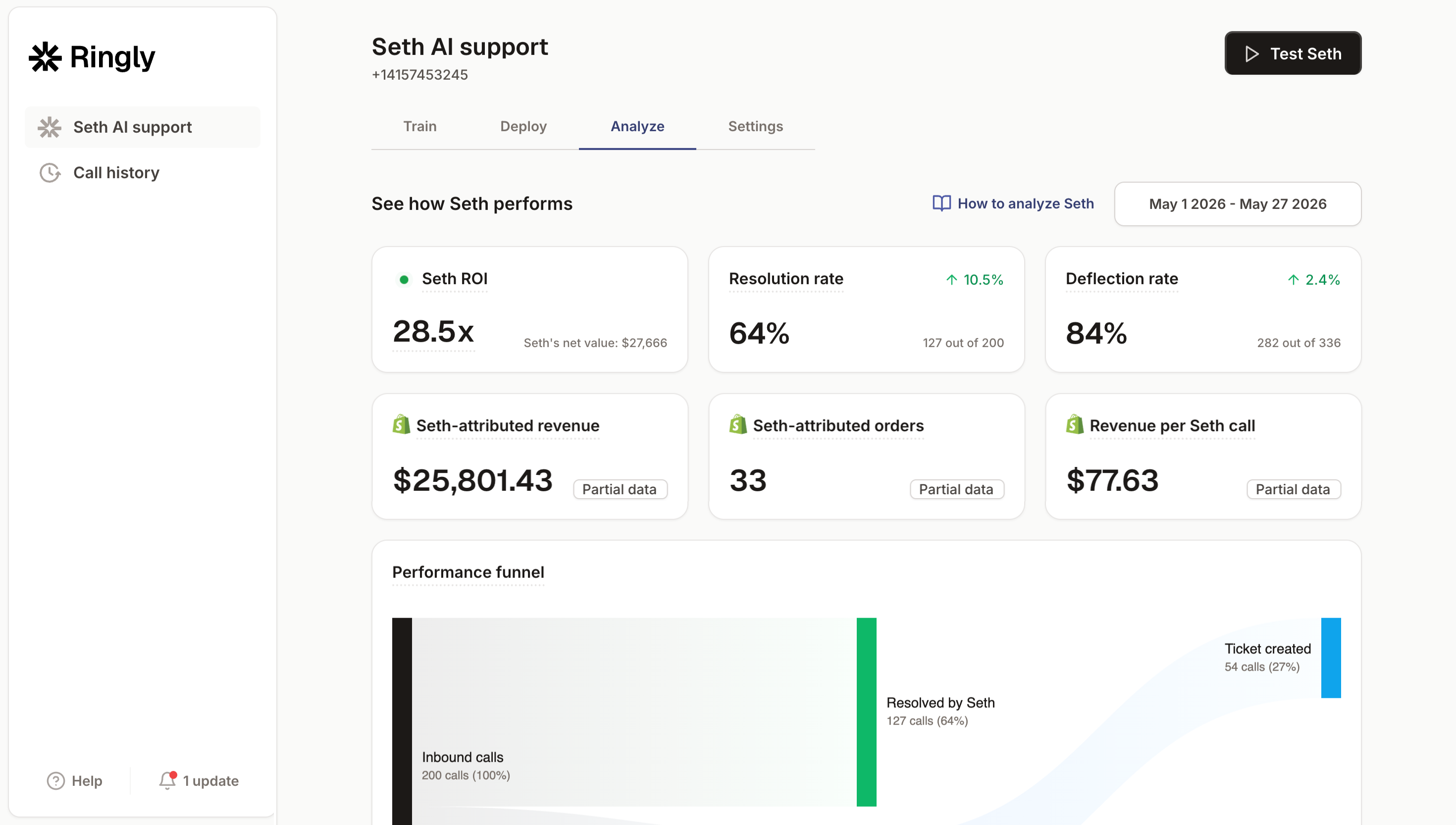
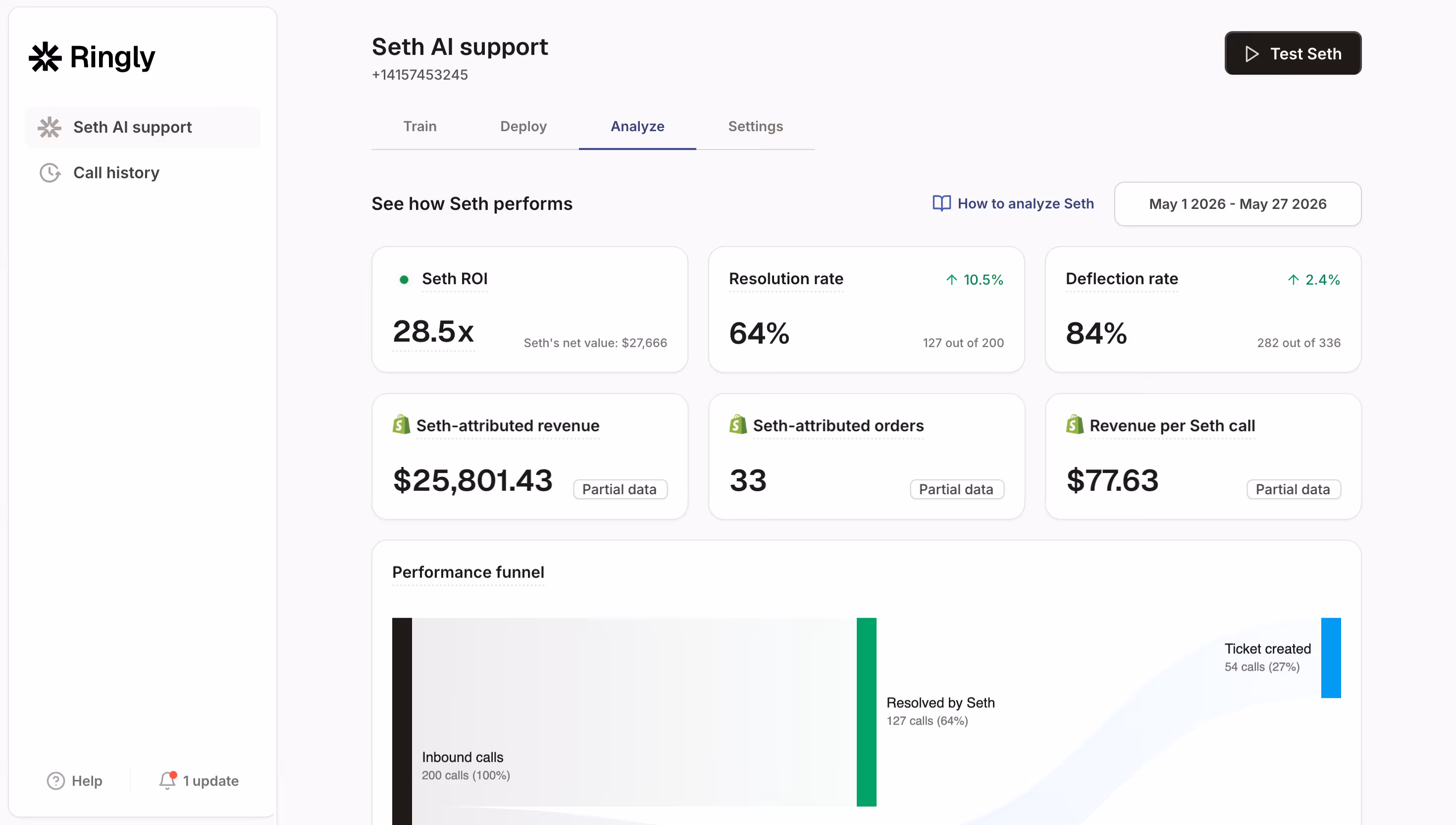
This is where Ringly fits, and it's not a subscription analytics tool, so I'll be clear about what it is. Ringly is AI phone support for Shopify brands. When a subscriber calls to pause, change a delivery date, ask where their order is, or talk themselves out of cancelling, the AI answers, 24/7, resolves the routine ones, and escalates the rest to your team. Across 50+ brands it resolves 73% of inbound calls on its own at roughly $0.42 per resolved call. BioLongevity Labs, a supplement brand on Ringly, resolves 79% of its calls autonomously, which on a replenishment subscription means a lot of pause-instead-of-cancel saves that would otherwise have hit the churn chart.
For a $30M Shopify subscription brand, the math is straightforward. A 6-rep CS team at $4,000 loaded per rep is $24,000/mo. Ringly Enterprise lands near $5,000/mo and takes the 70% of calls that are the same questions over and over, which frees your team for the genuinely hard saves. Net, that's roughly $19,000/mo back, and a phone line that's actually answered when the cancel call comes in.
"My customers also feel like it's a normal person. They feel like they can communicate if they have questions."
Claudia Droge, TechCraft Studio
If your retention chart is trending the wrong way and you suspect some of it is calls going to voicemail, book a 30-min call and we'll look at the after-hours queue underneath your numbers. More on the operational side in our guides to subscription cancellation management, ecommerce customer retention, and 24/7 ecommerce phone support.
Frequently asked questions
What is subscription analytics software?
It's software that turns raw billing and subscriber events into the metrics that show whether your recurring revenue is healthy: MRR, ARR, churn, LTV, and cohort retention. Tools like ChartMogul and Baremetrics read your billing system, while Shopify-native tools like Recharge and Loop read your subscription data directly.
What's the difference between subscription analytics and subscription billing software?
Billing software charges your customers and handles invoices and dunning. Analytics software reads that billing data and reports the metrics on top of it. Some platforms (Maxio, the Shopify apps) do both, but the analytics job is the reporting layer, not the charging layer.
Do I need a separate analytics tool if I'm on Recharge or Loop?
Usually not at first. Recharge and Loop both report MRR, churn, cohort retention, and recovery analytics on your actual Shopify subscription data. Add a SaaS-grade tool like ChartMogul mainly when you need investor-grade reporting that a Shopify app's dashboard doesn't quite cover.
Is ChartMogul or ProfitWell actually free?
ChartMogul is free with full core analytics under $10K MRR, then moves to paid bands. ProfitWell's metrics are genuinely free with no MRR cap; the company makes money on its paid Retain churn-recovery product. Both are real free options, just know where each one starts charging.
What's a good subscription churn rate for a DTC brand?
The average ecommerce subscription brand churns 6.5-8.5% monthly. Good is 5-7%, and under 5% puts you in the top quartile. Replenishment categories like supplements, coffee, and pet consumables typically run under 4% monthly.
Will subscription analytics software reduce my churn?
It will show you where churn happens, which is the first step, but it doesn't fix it on its own. Reducing churn means acting on what the dashboard shows: recovering failed payments, improving onboarding, and answering the pause-or-cancel calls before they become cancellations.
Talk to us

If you run a $10M-$100M Shopify subscription brand and your churn chart is trending up, a 30-min call is the fastest way to see how much of it is calls you're not answering, not customers you're losing.
The 3-layer guarantee.
- Live in 14 days or it's free until launched.
- 65% resolution in 90 days or we refund the last 3 months of subscription fees.
- We keep working free until we hit 65%.
Ruben (Ringly co-founder) takes these calls personally.