
Running an online store means juggling data from dozens of sources.
Your Shopify store tracks orders. Google Analytics monitors traffic. Facebook Ads reports on campaign performance.
Your email platform shows open rates. By the time you've checked everything, half your morning is gone and you're not sure what any of it means.
This is where ecommerce dashboards come in.
They pull all that scattered data into one place, turn it into visual charts you can actually understand, and help you spot problems before they cost you money.
Editor’s note: Want to hear some sample AI support calls made for your Shopify store?
- Just paste your store URL
- Get sample calls in under 20 seconds (no email required)
- Listen to demo calls for my store
Let's break down what ecommerce dashboards are, why they matter, and how to build one that actually helps your business grow.
What is an ecommerce dashboard?
An ecommerce dashboard is a visual interface that automatically collects performance data from your online sales channels and displays it in formats you can actually use, like charts, graphs, and tables.
Think of it as mission control for your store. Instead of logging into five different platforms to check how things are going, you get one screen that shows you the health of your entire business at a glance.
The data typically comes from sources like:
- Your ecommerce platform (Shopify, WooCommerce, BigCommerce)
- Marketing platforms (Google Ads, Facebook Ads, email tools)
- Analytics tools (Google Analytics, Hotjar)
- Customer databases and CRMs
- Inventory management systems
- Payment processors
A good dashboard doesn't just dump numbers on a screen. It organizes them logically, highlights trends and anomalies, and lets you drill down when something needs your attention.
When your conversion rate suddenly drops, you should be able to see it immediately and figure out why without digging through spreadsheets.
Why ecommerce dashboards matter for online stores
Ecommerce businesses generate massive amounts of data. Every click, purchase, return, and support ticket creates a data point.
Without a dashboard, that data sits in silos, making it nearly impossible to see the big picture.
Here's what happens when you don't have a dashboard: Your marketing team checks Facebook Ads and thinks campaigns are performing well.
Your operations team sees inventory running low on a popular item. Your support team notices an uptick in "where's my order" tickets.
Nobody connects the dots that a viral social post drove unexpected traffic that depleted stock and created shipping delays.
A dashboard fixes this by giving everyone the same view of the business. Marketing sees that their campaign drove a traffic spike.
Operations sees inventory dropping. Support sees the correlation between stockouts and ticket volume. Suddenly everyone's working from the same information.
The benefits go beyond collaboration:
- Faster decisions: When data updates in real-time, you can spot issues and opportunities as they happen, not days later.
- Reduced manual work: No more copying numbers from five platforms into a spreadsheet every Monday morning.
- Better forecasting: Historical data patterns help you predict demand, plan inventory, and budget marketing spend.
- Improved customer experience: When you can see support ticket trends alongside sales data, you can allocate resources before service quality drops.
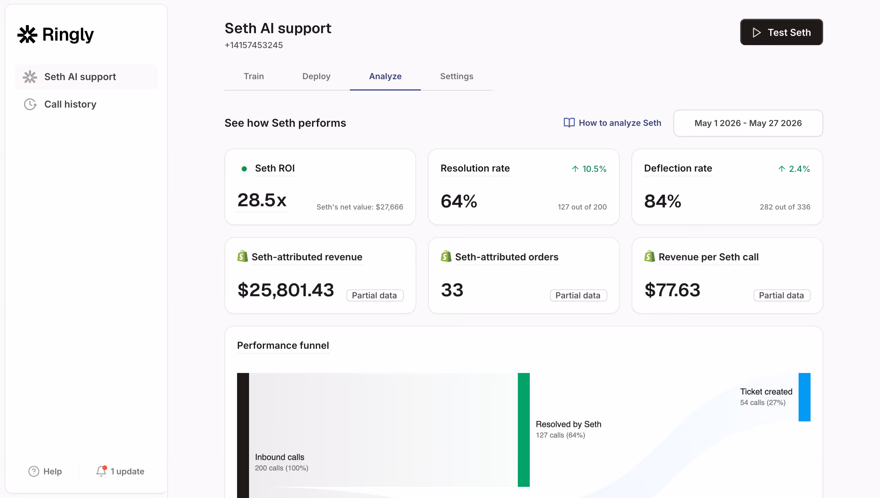
Tools like Ringly.io extend this concept to phone support, giving you dashboards that track call volumes, resolution rates, and customer satisfaction alongside your other ecommerce metrics.
When you can see that a product launch drove both a sales spike and a support call surge, you can prepare your team accordingly.
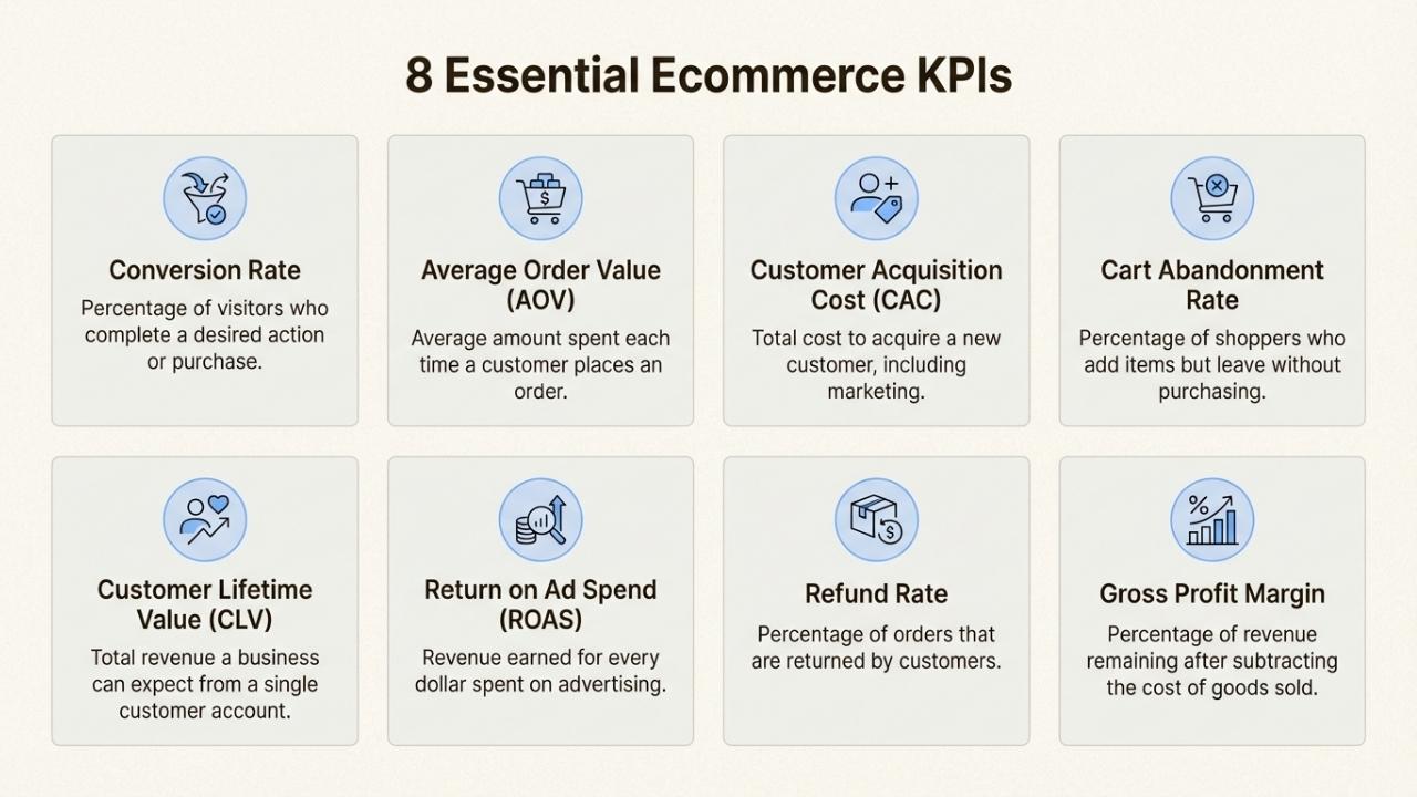
Essential metrics every ecommerce dashboard needs
Not all metrics deserve dashboard space. The best dashboards focus on a handful of key performance indicators (KPIs) that actually drive decisions.
Here's what belongs on your ecommerce dashboard:
Sales performance
Track total revenue, number of orders, and sales trends over time. This tells you whether you're growing and helps identify seasonal patterns.
Break this down by channel (organic, paid, email, social) to see which efforts are paying off.
Average Order Value (AOV)
AOV measures how much customers spend per transaction. Calculate it by dividing total revenue by number of orders.
If your AOV is $75 and you want to increase it, you might test bundling, free shipping thresholds, or upsells.
Conversion rate
This is the percentage of visitors who make a purchase. If 1,000 people visit your store and 20 buy something, your conversion rate is 2%.
Industry averages vary by niche, but most ecommerce stores see 1-3%. A sudden drop often signals a technical issue or checkout problem.
Customer Acquisition Cost (CAC)
CAC tells you how much you spend to get one new customer. Add up all your marketing costs for a period and divide by the number of new customers acquired.
If you spent $5,000 on ads and got 100 new customers, your CAC is $50.
Compare this to your average customer lifetime value to ensure you're not spending more to acquire customers than they're worth.
Customer Lifetime Value (LTV)
LTV estimates how much revenue a typical customer generates over their entire relationship with your store.
Calculate it by multiplying average order value by purchase frequency by customer lifespan.
If customers spend $75 per order, buy 3 times per year, and stay active for 2 years, your LTV is $450.
Website traffic
Monitor unique visitors, page views, bounce rate, and traffic sources. This helps you understand where customers come from and how they behave on your site.
A high bounce rate on your product pages might indicate pricing issues or poor product descriptions.
Inventory metrics
Track stock levels, reorder points, and inventory turnover rates. Running out of stock costs you sales.
Carrying too much inventory ties up cash and increases storage costs. Your dashboard should flag items running low and identify slow-moving products.
Support metrics
Include response times, resolution rates, and customer satisfaction scores. Fast, helpful support turns one-time buyers into repeat customers.
If resolution rates drop while ticket volumes spike, you know you need more staff or better self-service options.
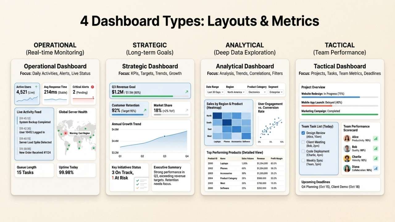
Types of ecommerce dashboards (with examples)
Different roles need different data. A CEO wants high-level trends. A marketing manager needs campaign details.
An operations lead cares about inventory and fulfillment. Most ecommerce businesses end up with several specialized dashboards rather than one giant screen.
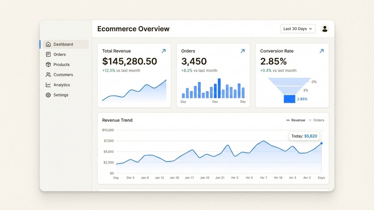
Executive overview dashboard
This is the 30,000-foot view for leadership. It shows revenue trends, total orders, average order value, and returning customer rates.
The goal is to answer "How is the business doing?" in under 30 seconds. Charts are simple. Numbers are big. Trends are highlighted with color coding (green for good, red for concern).
Marketing performance dashboard
Marketing teams need to see which channels drive results. This dashboard tracks traffic sources, campaign ROI, cost per acquisition by channel, email open rates, and social engagement.
It helps marketers double down on what works and cut what doesn't.
Sales and orders dashboard
Operations teams live here. It shows order volume throughout the day, fulfillment status, shipping times, and return rates.
When order volume suddenly spikes, operations knows to allocate more staff to fulfillment. When shipping delays cluster around a specific carrier, it's time to investigate.
Inventory and operations dashboard
This tracks stock levels across warehouses, reorder points, vendor performance, and product turnover.
It prevents stockouts and identifies slow-moving inventory that needs discounting. Smart inventory dashboards also factor in lead times, so you reorder before you hit critical levels.
Customer support dashboard
Support leaders track ticket volumes, response times, resolution rates, and customer satisfaction scores.
They can see which products generate the most questions, which issues take longest to resolve, and whether service quality is improving or declining.
Dashboard design best practices
A dashboard with the right metrics can still fail if it's poorly designed. Here are principles that separate useful dashboards from digital wallpaper:
The 5-second rule
Users should grasp the key insight within 5 seconds of looking at your dashboard. If it takes longer, your design is too cluttered.
Put the most important numbers at the top left (where eyes naturally go). Use large fonts for critical metrics. Reserve detailed tables for drill-down views.
Visual hierarchy matters
Not all data deserves equal prominence. Revenue trends get the biggest chart. Secondary metrics get smaller widgets.
Use size, color, and position to guide attention to what matters most.
Color with purpose
Red and green work well for positive and negative trends, but use them consistently.
If green means "good" in one chart and "bad" in another, you'll confuse everyone. Avoid rainbow color schemes that don't communicate meaning.
Less is more
Resist the urge to add every metric you can think of. Each additional chart makes the dashboard harder to scan.
Start with 5-7 key metrics. Add more only when users consistently ask for them.
Mobile responsiveness
Executives check dashboards on phones. Marketing managers review them on tablets.
Make sure your dashboard works on small screens, even if it means showing simplified views.
Real-time vs. historical
Not everything needs to update every second. Sales numbers benefit from real-time updates. Monthly revenue comparisons work fine with daily refreshes.
Match update frequency to how quickly decisions get made.
Choosing the right dashboard tools
You have options ranging from free built-in tools to enterprise business intelligence platforms. Here's how to think about the choice:
Free and built-in options
Google Looker Studio (formerly Data Studio) connects to Google Analytics, Google Ads, and many other sources for free.
It's limited but functional for basic reporting. Shopify's built-in analytics work well for stores just starting out. The downside is customization.
You're stuck with what the platform gives you.
Ecommerce-specific platforms
Tools like Geckoboard, Databox, and Polar Analytics are built specifically for ecommerce.
They offer pre-built templates, Shopify integrations, and metrics that matter to online stores. Pricing typically runs $50-200 per month depending on data volume and features.
Business intelligence tools
Tableau, Microsoft Power BI, and Looker offer unlimited customization and powerful analysis capabilities.
They're overkill for small stores but essential for businesses with complex data needs or multiple data sources.
Expect to invest in setup and training. Pricing starts around $70 per user per month.
When to build vs. buy
Build a custom dashboard only if you have unique data sources that off-the-shelf tools can't connect to, or if you need highly specific calculations that standard platforms don't support. For 95% of ecommerce businesses, buying saves time and money.
Ringly.io offers a specialized approach for phone support analytics.
While most dashboards focus on digital channels, Ringly tracks call volumes, resolution rates, and customer satisfaction for stores that handle significant phone traffic.
If phone support is a major channel for your business, consider tools that include voice analytics alongside your other dashboard data.
Getting started with ecommerce dashboards
You don't need to build the perfect dashboard on day one. Start simple and iterate based on what you actually use.
Step 1: Define your key metrics. Pick 5-7 numbers that would change how you run your business if you knew them every morning. Don't worry about being comprehensive. Worry about being actionable.
Step 2: Identify your data sources. Where does each metric live? Shopify? Google Analytics? Your email platform? Make a list of the systems you need to connect.
Step 3: Choose your tool. Based on your budget, technical skills, and data complexity, pick a platform that can connect to your sources. Most offer free trials, so test before committing.
Step 4: Build and iterate. Start with one dashboard. Use it for a week. Notice what you check first, what you ignore, and what's missing. Adjust accordingly.
Common mistakes to avoid: Trying to track too many metrics, building dashboards nobody looks at, ignoring mobile users, and setting up dashboards that don't update automatically.
A dashboard that requires manual data entry will be abandoned within a month.
If you're looking to improve your customer support visibility alongside your sales data, start a free trial with Ringly.io.
Their AI phone agent The AI handles calls while giving you detailed analytics on resolution rates, common issues, and customer satisfaction, all visible in a clean dashboard that integrates with your broader reporting strategy.
Frequently Asked Questions
What are ecommerce dashboards used for?
Ecommerce dashboards centralize data from multiple sources (sales, marketing, inventory, support) into visual displays that help online stores monitor performance, spot trends, and make faster decisions. They replace manual spreadsheet reporting with real-time, automated insights.
Which metrics should my ecommerce dashboards include?
Start with 5-7 essential metrics: total revenue, conversion rate, average order value, customer acquisition cost, website traffic, and inventory levels. Add support metrics if phone or chat is a major channel. Focus on metrics that drive decisions, not vanity numbers.
How much do ecommerce dashboards cost?
Free options like Google Looker Studio work for basic needs. Ecommerce-specific platforms like Geckoboard or Databox cost $50-200 per month. Enterprise BI tools like Tableau or Power BI start around $70 per user monthly. Most businesses can start with lower-cost options and upgrade as needs grow.
Can I build ecommerce dashboards without technical skills?
Yes. Modern dashboard tools use drag-and-drop interfaces that don't require coding. Shopify stores can use built-in analytics or apps from the Shopify App Store. Tools like Geckoboard and Databox offer pre-built templates specifically for ecommerce.
How often should ecommerce dashboards update?
Match update frequency to decision speed. Sales and traffic metrics benefit from real-time or hourly updates. Revenue comparisons and trend analysis work fine with daily refreshes. Monthly reports can update weekly. Real-time updates sound appealing but can create noise if data fluctuates normally.
What's the difference between ecommerce dashboards and regular analytics?
Analytics tools collect and store data. Dashboards visualize that data for quick consumption. Google Analytics is an analytics tool. A dashboard might pull data from Google Analytics, Shopify, and Facebook Ads to show a unified view of marketing performance. Dashboards sit on top of analytics tools.
Should I have multiple ecommerce dashboards or one master dashboard?
Most successful ecommerce businesses use multiple specialized dashboards rather than one overwhelming screen. Executives get high-level overviews. Marketing teams see campaign performance. Operations tracks inventory and fulfillment. Different roles need different data, and trying to put everything in one place creates clutter.